


Selecting the Best Chart for Your Healthcare Data
This is the third in a series of guest blogs from Juice Analytics.
The best chart is usually not the newest, most elaborate, or most colorful. In fact, it's often the opposite. You don't order a medical test for a patient just because you can--don't just use the sexiest chart available either. So, how do you determine which chart is right for your audience?
Here's are a few steps to use when creating charts or displaying information.
Think People First
First rule or step. It's not about you or your capabilities. Its about getting your audience to value what you're trying to communicate. Consider these questions as they can impact things like the type or sophistication of your chart
- Is this something your audience has seen before? Is it familiar to them? Do they work with data often?
- When and where will they use it? At their desk? On a mobile device?
- What question are you trying to help them answer?
As it relates to how questions relate to chart selection see the graphic below. In many ways the question we're answering for our audience informs how we should display the information. Note specifically in the lower question how "time" and "trend" suggests that this will be a chart specifically related to trends like a line graph.
Selecting Chart Types
With questions and audience knowledge under your belt, you can start to consider what charts make the most sense. Here are the major chart types as illustrated by the folks at Extreme Presentation and their Chart Chooser Tool. With a chart category in mind, such as comparison or relationship, you can start to define how basic or rich it can be. If it's a paper based report or presentation for first time readers, a pretty basic selection is probably in order. However, if its to be displayed on an iPad, by folks familiar with the data you have more latitude to incorporate interactivity or sophistication.
Formatting
Once the chart type is selected you need to format it. In many ways the colors selected, text written, labeling and font used should reinforce what is being communicated by the chart and visa vera. The chart and its formatting should co-exist well.
Here are some resources to help with how your text should be displayed as well as how to apply color purposefully.
How to apply fonts -Simple Font Framework
How to use color - Color has Meaning
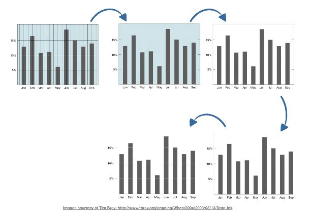
Simplicity
"Perfection is achieved, not when there's nothing more to add, but when there is nothing left to take away." -- Antoine de Saint-Exupéry
It's a good habit to make your last step all about simplifying your chart display. It used to be the case that Excel included all this extra formatting that needed to be removed. This isn't the case any longer, but check out the Data to Ink principle below in practice. If it doesn't add anything for the user than remove it. Less is always more, especially decision makers.
Feedback
Applying these steps to your chart selection and information sharing will take you a long way. For the first couple of times think about getting feedback from your peers or audience themselves to see if they walk away with the intended interpretation.
Once you beyond these initial steps consider an Edward Tufte class, some data visualization books, like Data Fluency or others to continue to advance your skills. Happy charting!
About Juice
Juice is an expert in designing and building web applications that connect people with data. We work with clients across industries including healthcare, digital advertising, and other data-rich businesses. Founded in 2004, Juice has offices in Nashville, Atlanta, and Washington, D.C.
Our people, our platform and our passion are all dedicated to building data products that people love to use. To us, this means finding better ways of capturing the excitement of finding an insight and sharing it with a colleague. This means telling a story using data that unfolds as your understanding grows. This means delivering data products that make your customers say, "Wow!"
HealthStream—which made a minority equity investment in Juice last year—was instrumental in a Juice headquarters relocation to Nashville one year ago, with both companies recognizing the potential of Juice and its products to support HealthStream's network, including Nashville's data-rich healthcare industry.